Dashboard
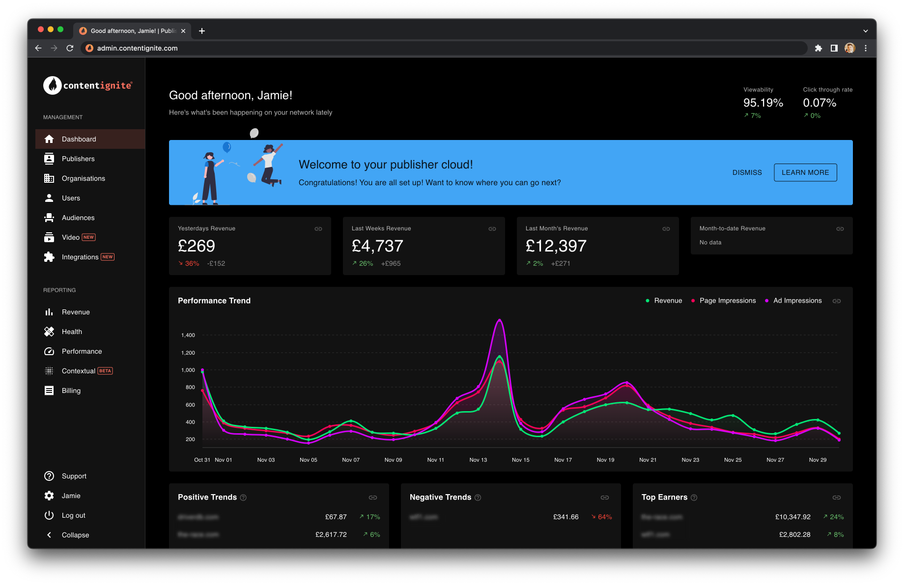
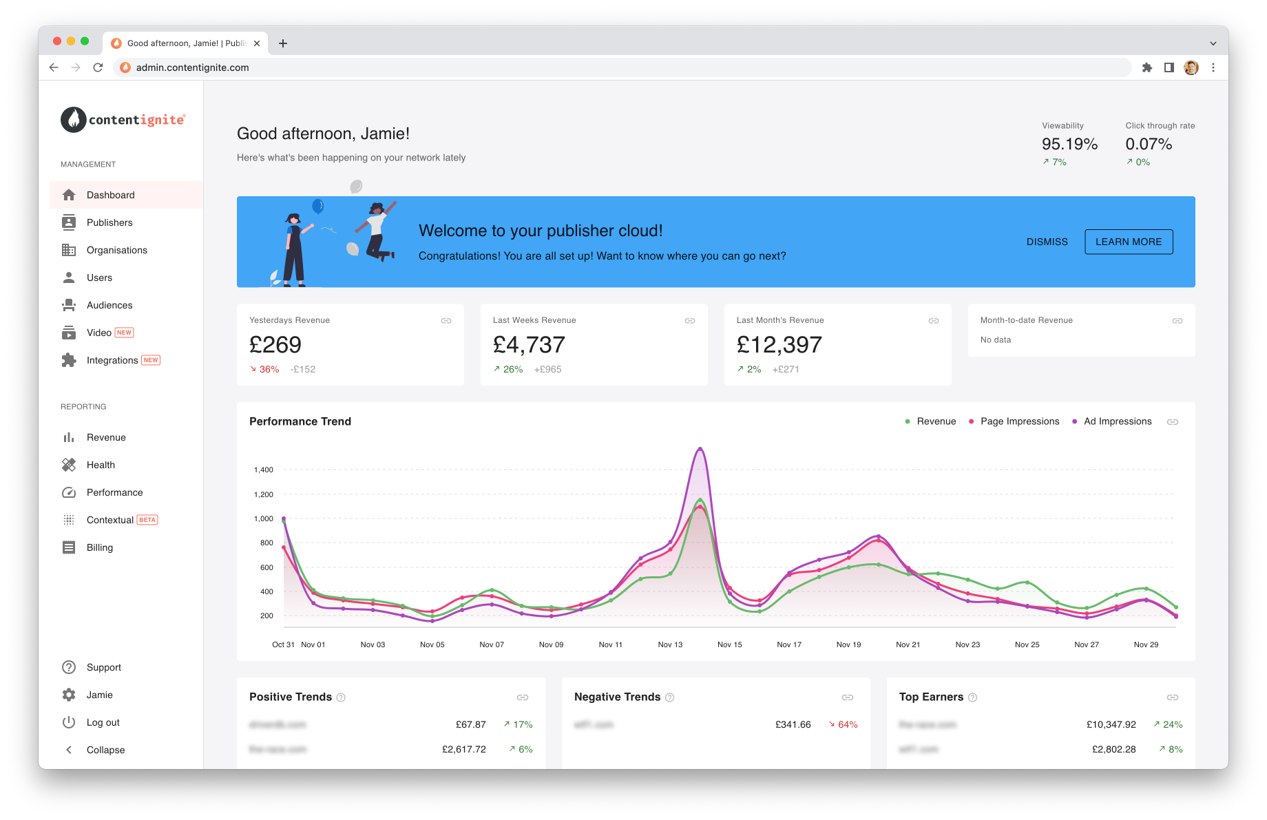
Your dashboard provides at a glance information for all publishers in your immediate network, designed to help you keep track of the health of your network as a whole, spot trends and set your baselines & targets.
Onboarding
If you are new to our platform, the first thing you will see is our onboarding banner. This is designed to take you through the system and all the steps needed to get set up, get live and start earning.
Open up the banner to see all your onboarding steps and instructions on how to complete them. We are here if ever you need us, but between our onboarding flow and our docs site here, you are free to onboard yourself at your own leisure.
Once you have completed the core steps, you can continue on to learn about other areas of the system, or dismiss the banner for good.
Stats
You will see a number of top line revenue stats and performance metrics followed by your performance graph. On this graph, page impressions and ad impressions have been normalised to the revenue line, keeping them close together so spotting what might be impacting revenue is made easy.
Finally, negative and positive trend tables show you your highlights and the publishers you might want to take a look at, followed by your top earners so you always have eyes on the publishers that move the needle.
Filtering
Our reporting follows a familiar UX across the whole of Fusion, where you can find a publisher filter in the top right, along with a button to access additional filters. These additional filters include switching between Net and Gross revenue, and filtering by revenue source.
Diving in deeper
Your dashboard is not meant to answer every question you have, it is there for you to keep your finger on the pulse of your publishers. To dive in deeper, use the powerful tabular data reporting of Report Builder, or explore your data visually over in the Insights Hub.