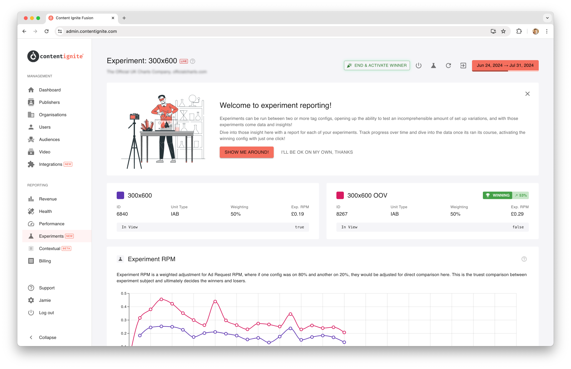
 The reason for running an experiment is to gain insight into configs performance, and the experiment report is where you do just that!
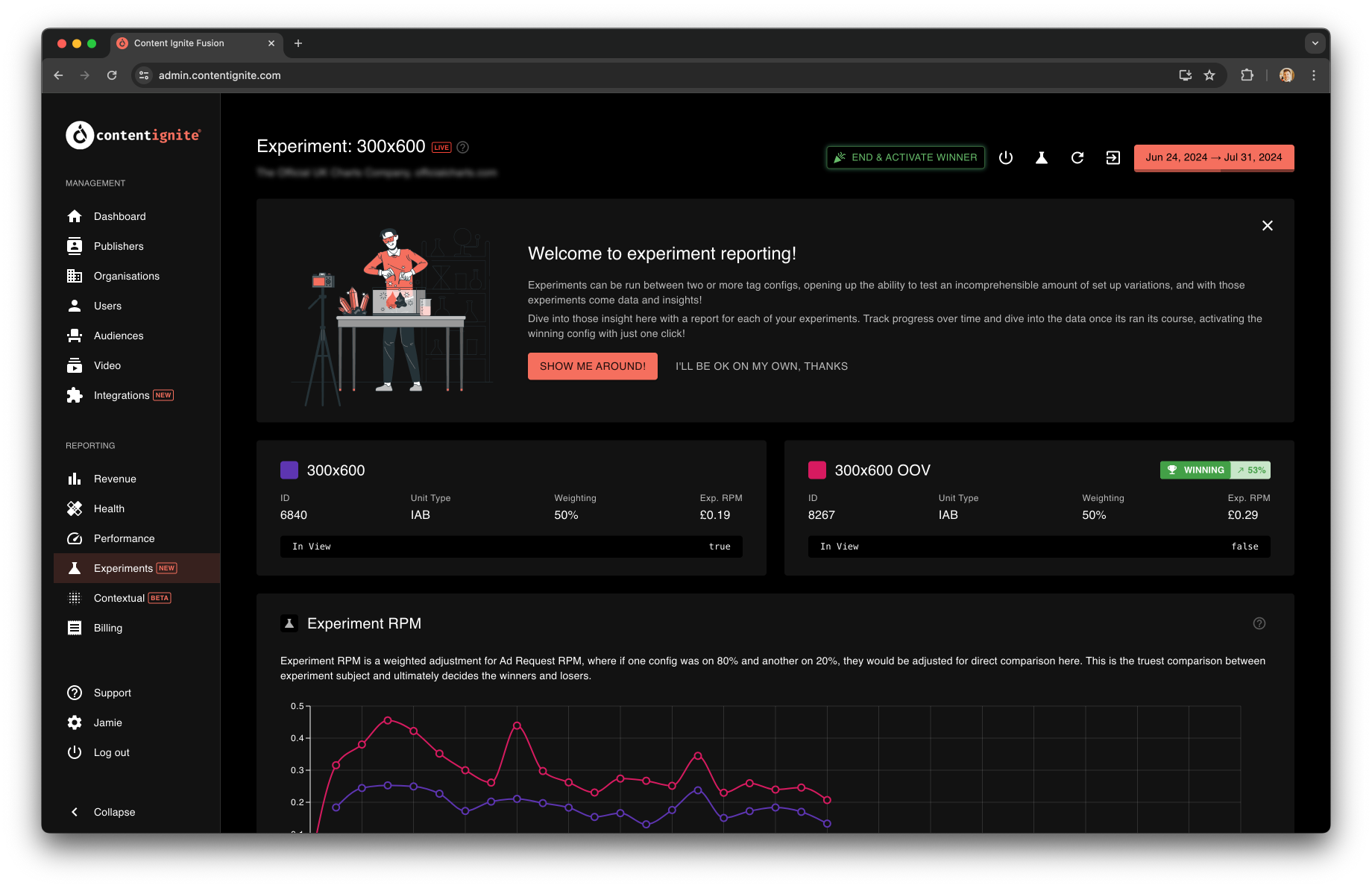
Status & Actions
 View the experiment status at the top of the page next to the experiment name. An experiment can be ‘Scheduled’, ‘Live’ or ‘Completed’.
The date range of the experiment is viewable in the top right of the page, and if live, will show a progress bar representing how far through the experiment you are (percentage shown on hover).
There are various actions you can take during the life of an experiment, available via the action buttons in the top right of the page. Things such as terminating the experiment (if live), or jumping into the experiment configuration page.
View the experiment status at the top of the page next to the experiment name. An experiment can be ‘Scheduled’, ‘Live’ or ‘Completed’.
The date range of the experiment is viewable in the top right of the page, and if live, will show a progress bar representing how far through the experiment you are (percentage shown on hover).
There are various actions you can take during the life of an experiment, available via the action buttons in the top right of the page. Things such as terminating the experiment (if live), or jumping into the experiment configuration page.

Winner Activation
A major action is activating the winning config. This is a handy shortcut that will terminate the experiment if it is still live, and activate the winning config while deactivating the losing configs. Your Publisher Tag will be re-built and deployed within 10 minutes. This is an optional action and picks the winner based on the Experiment RPM. If other metrics such as Viewability or fill rate are a consideration for you, then the data should be reviewed and the winner determined independently. This button will adapt based on the experiment status and winner uplift. Where a small button is shown in a close running, and a large green button shown when there is a clear winner, as you may want to terminate an experiment early to reap the full reward of the winning config.Early Termination
A quick way to terminate an experiment early if you feel things are not going well, or that you have gathered enough data to answer your questions. Find out more about this feature here: Experiments: Early TerminationConfig Overview
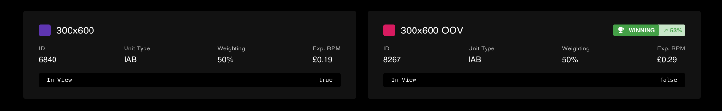
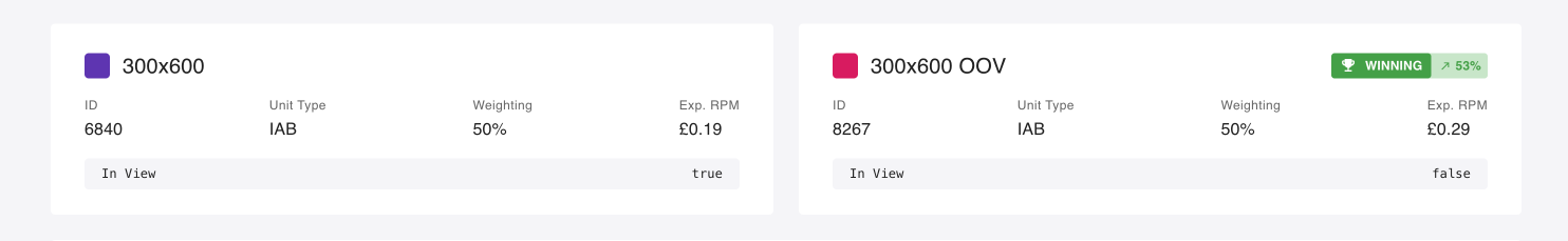 See an overview of each config (name, id, unit type) and details of the experiment setup (weighting and current RPM). Underneath the top-line information is the all-important configuration differences, this highlights what is different between the configs, and ultimately what changes you are experimenting on.
Each config has an assigned colour, that will mary up with the charts further down the page.
See an overview of each config (name, id, unit type) and details of the experiment setup (weighting and current RPM). Underneath the top-line information is the all-important configuration differences, this highlights what is different between the configs, and ultimately what changes you are experimenting on.
Each config has an assigned colour, that will mary up with the charts further down the page.
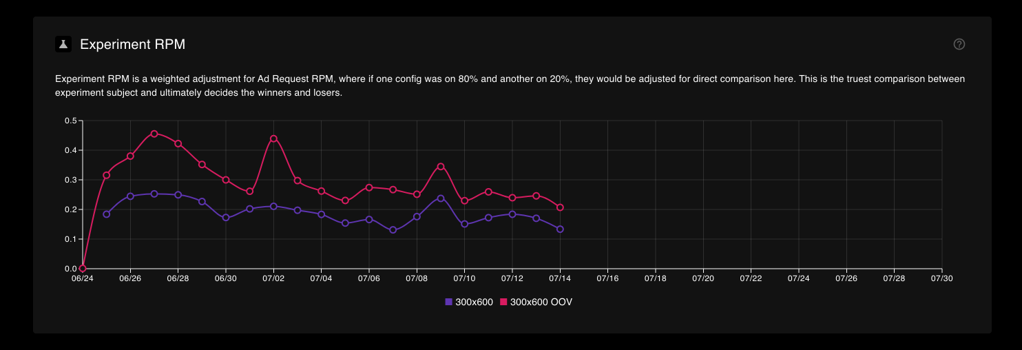
Experiment RPM
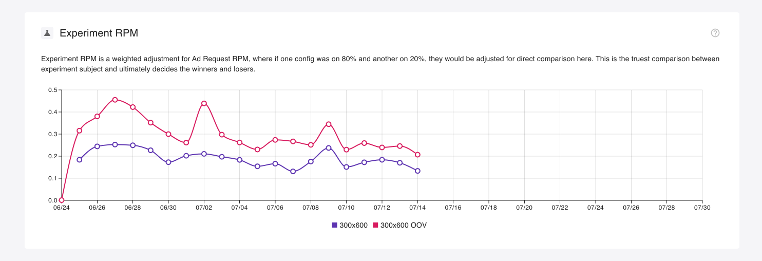 A calculation of revenue per 1,000 Ad Unit Loads.
This is the single most important metric in your experiment report, as it gives you a true gauge of the performance of each config, and ultimately, which did/will make you the most revenue.
Experiment RPM takes into account the weighting of your configs, so if you ran an 80/20 experiment split, values would be normalised allowing you to directly compare configs against one another.
A calculation of revenue per 1,000 Ad Unit Loads.
This is the single most important metric in your experiment report, as it gives you a true gauge of the performance of each config, and ultimately, which did/will make you the most revenue.
Experiment RPM takes into account the weighting of your configs, so if you ran an 80/20 experiment split, values would be normalised allowing you to directly compare configs against one another.
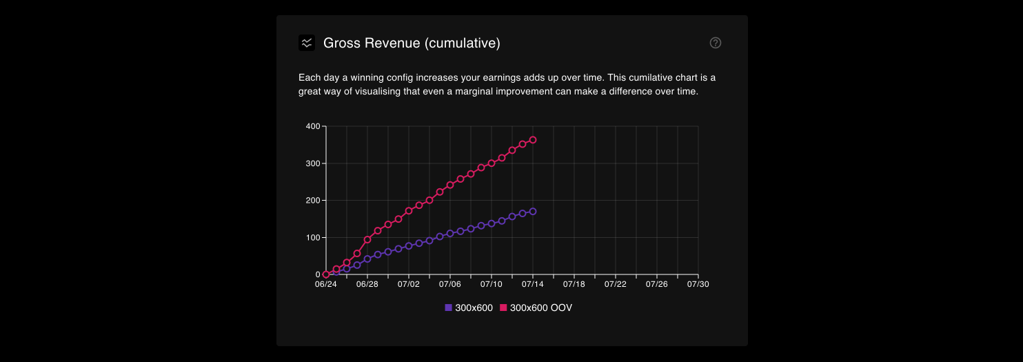
Gross Revenue (cumulative)
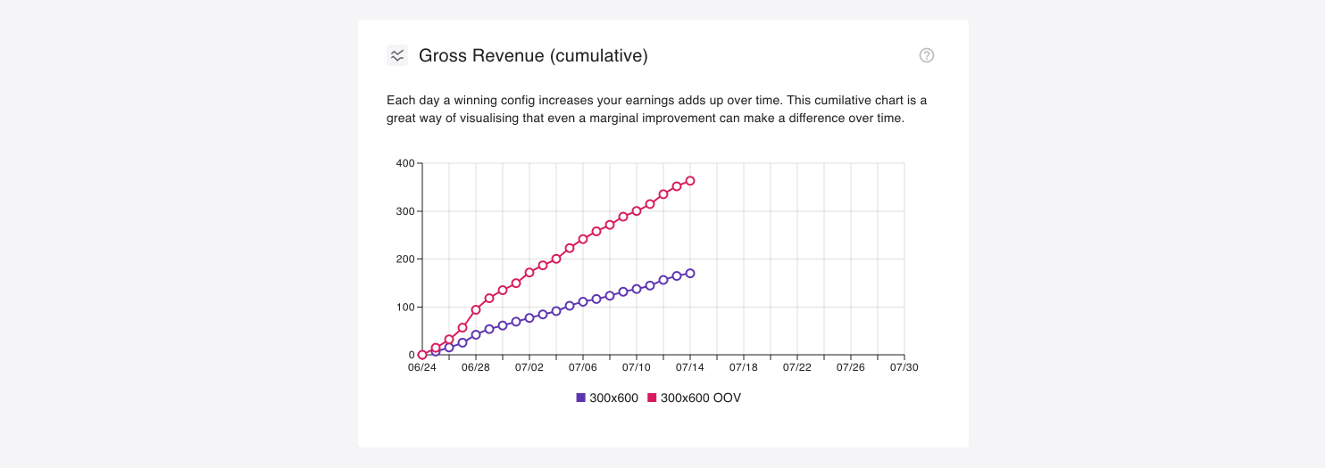 This view shows the gross revenue accumulation for each day. This is a great view to visualize how a small gain can add up over time and start to deviate away from a less performant config.
By default, we adjust all values to 100%, meaning that if two configs were set to 50% traffic share, their values would be doubled to real 100%. This allows for forecasting, and make for a fair comparison if traffic split is uneven (e.g. 40/60).
This can be toggled off to show raw revenue values by clicking the green scales symbol in the top right of the chart.
This view shows the gross revenue accumulation for each day. This is a great view to visualize how a small gain can add up over time and start to deviate away from a less performant config.
By default, we adjust all values to 100%, meaning that if two configs were set to 50% traffic share, their values would be doubled to real 100%. This allows for forecasting, and make for a fair comparison if traffic split is uneven (e.g. 40/60).
This can be toggled off to show raw revenue values by clicking the green scales symbol in the top right of the chart.
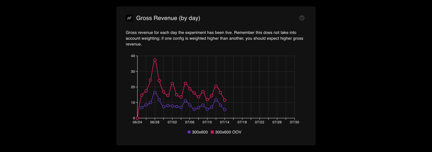
Gross Revenue (by day)
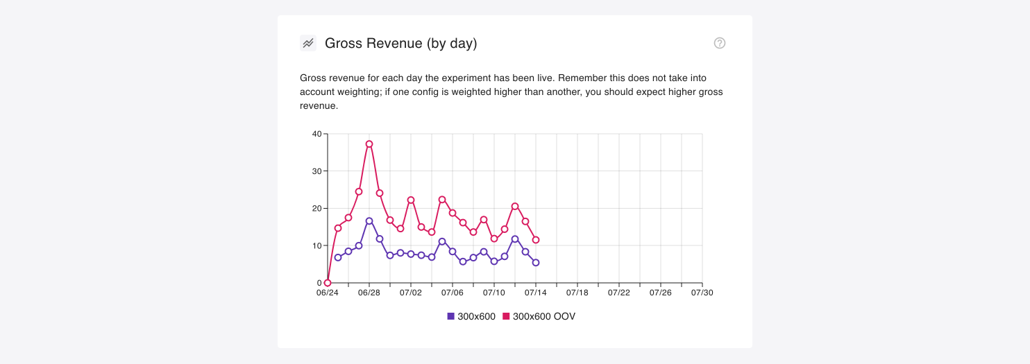 Similar to above, this chart is the gross revenue total for each day. This can help visualise how close (or distant) your experiment subjects are to one another.
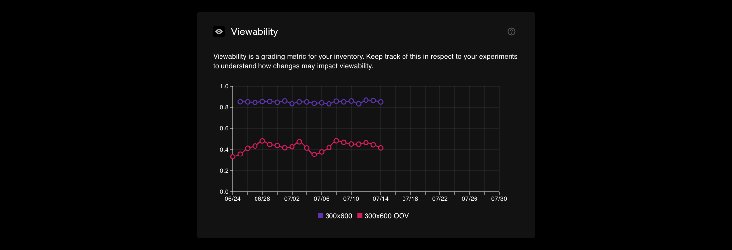
Viewability
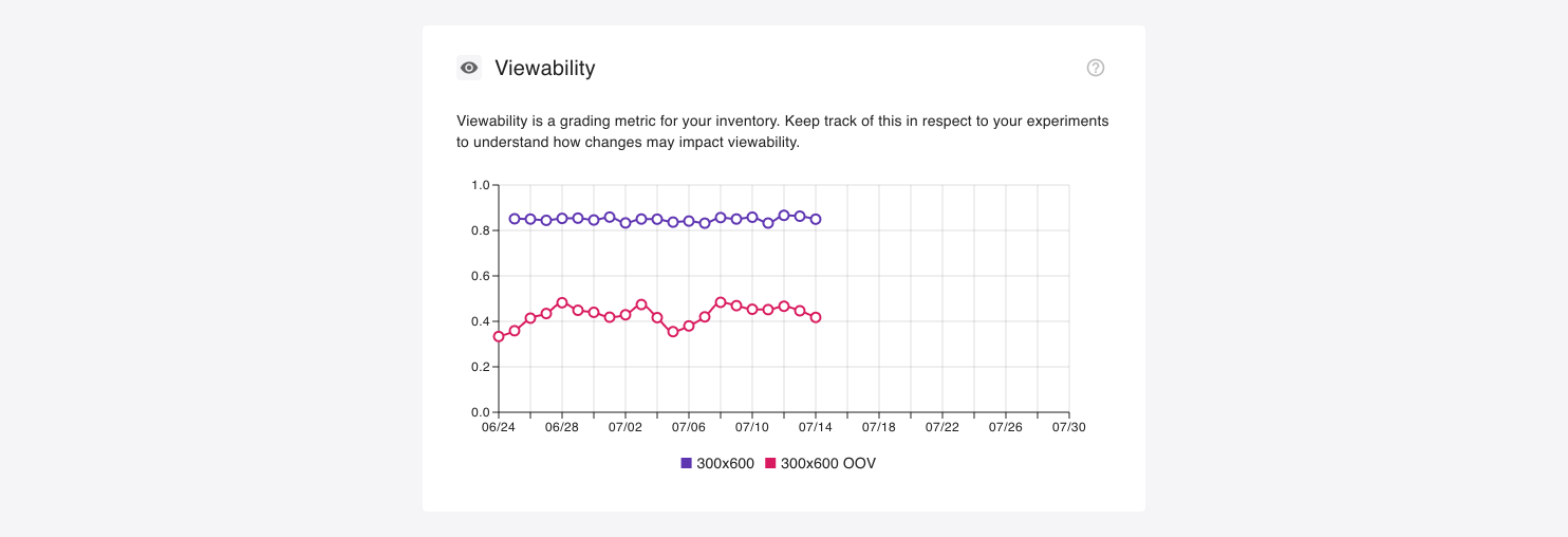 Viewability is a quality metric, where viewable inventory should hold more value. We say “should” because while it makes sense that advertisers wouldn’t want to pay for ads that are loaded out-of-view, we often see that OOV units can and do generate more revenue… It goes against all logic and our idealisms as a company, but digital advertising doesn’t always concern itself with these things!
We include this metric to give you the insights that will allow you to make informed decisions. If viewability is a priority, then any dip here should be taken into consideration when deciding on a winning config.
Viewability is a quality metric, where viewable inventory should hold more value. We say “should” because while it makes sense that advertisers wouldn’t want to pay for ads that are loaded out-of-view, we often see that OOV units can and do generate more revenue… It goes against all logic and our idealisms as a company, but digital advertising doesn’t always concern itself with these things!
We include this metric to give you the insights that will allow you to make informed decisions. If viewability is a priority, then any dip here should be taken into consideration when deciding on a winning config.
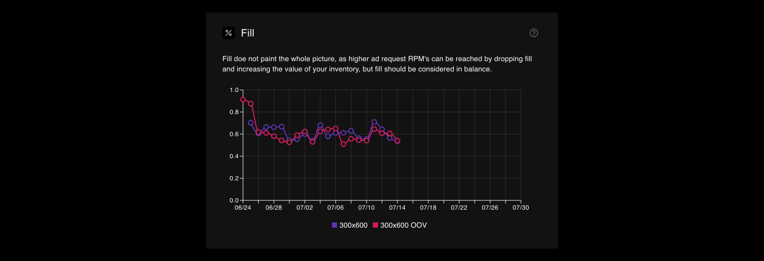
Fill
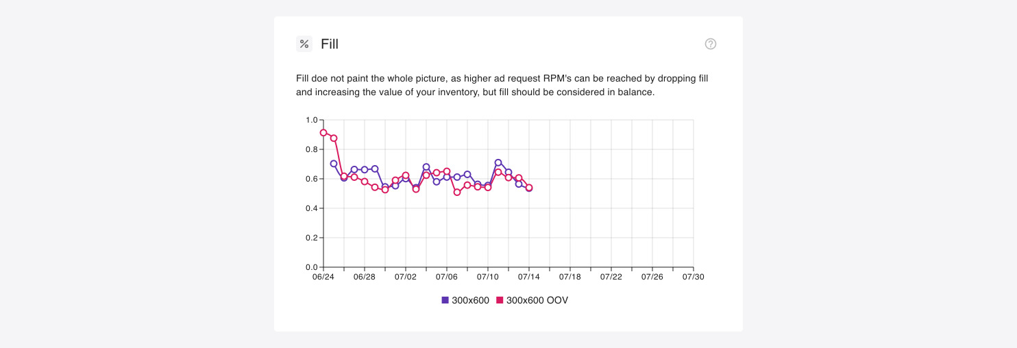 Fill is a well-rooted metric in the world of digital advertising, but holds less weight these days where less fill can in fact equal more revenue. We at Content Ignite focus squarely on yield, where increasing floors can drive up the value of your inventory and can lead to lower fill, but higher overall revenue. This needn’t mean blank ads mind you, as you can backfill with your own creatives and recirculate your users; a win-win!
That being said, every publisher has their own goals, where decreasing fill despite improving yield might not align with those goals for you. So use this chart to keep an eye on things to help inform your decision on the ultimate winner of the experiment.
Fill is a well-rooted metric in the world of digital advertising, but holds less weight these days where less fill can in fact equal more revenue. We at Content Ignite focus squarely on yield, where increasing floors can drive up the value of your inventory and can lead to lower fill, but higher overall revenue. This needn’t mean blank ads mind you, as you can backfill with your own creatives and recirculate your users; a win-win!
That being said, every publisher has their own goals, where decreasing fill despite improving yield might not align with those goals for you. So use this chart to keep an eye on things to help inform your decision on the ultimate winner of the experiment.
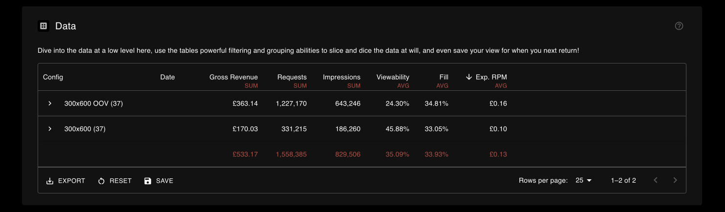
Data
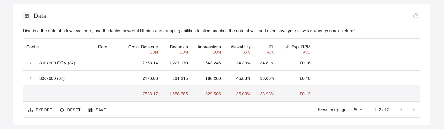 The data grid is where you will find all the raw data that made up the charts above it. You can export this data, slice and dice it with filters, grouping, sorting and aggregation to your hearts content. You can even save your view for other report viewers to see.
Use this to inform your next action upon experiment completion.
The data grid is where you will find all the raw data that made up the charts above it. You can export this data, slice and dice it with filters, grouping, sorting and aggregation to your hearts content. You can even save your view for other report viewers to see.
Use this to inform your next action upon experiment completion.